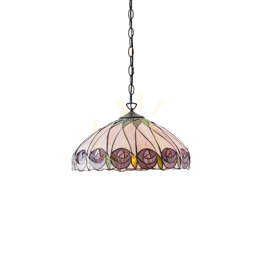
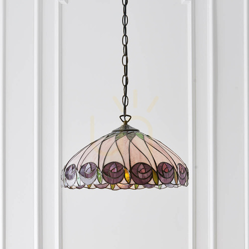
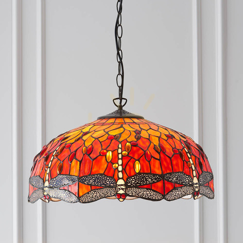
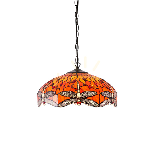
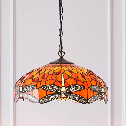
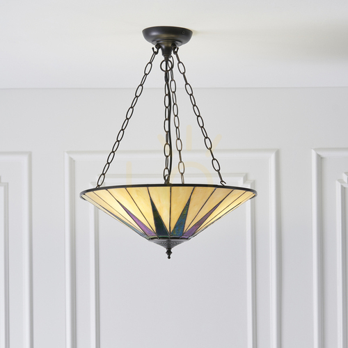
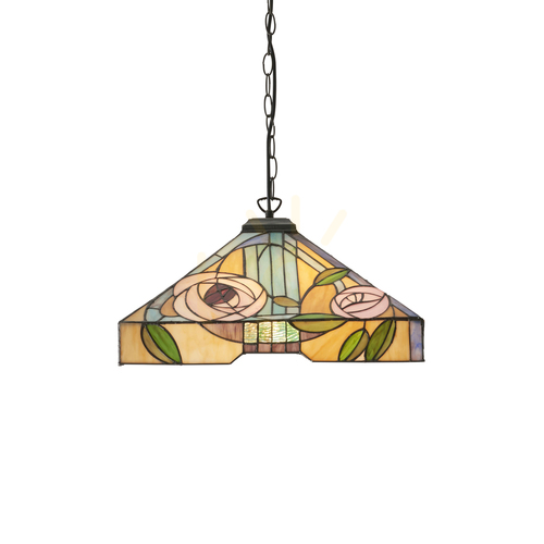
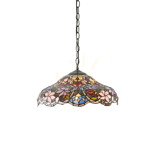
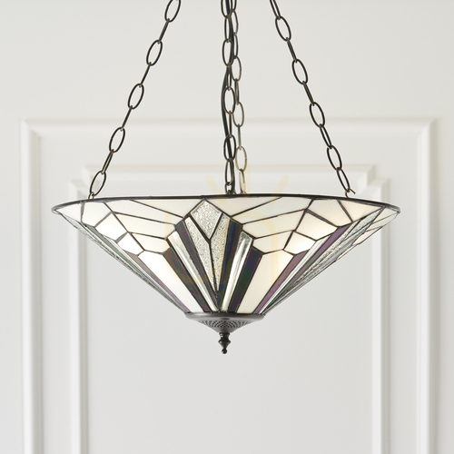
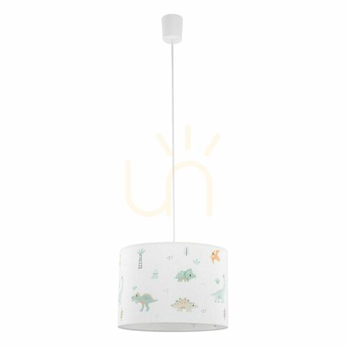
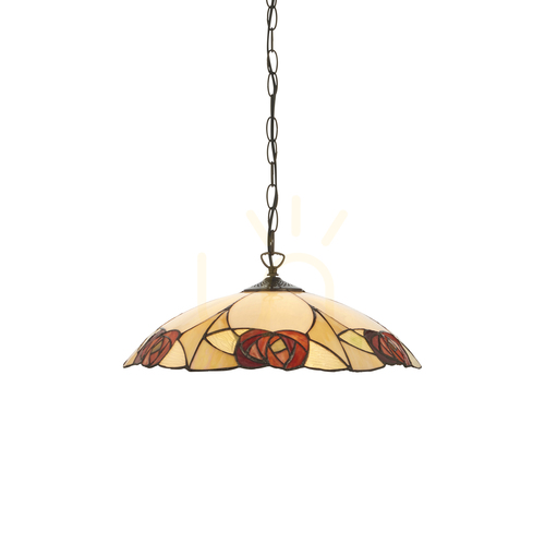
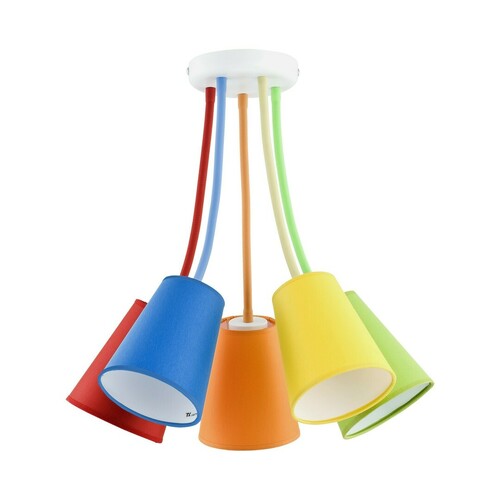
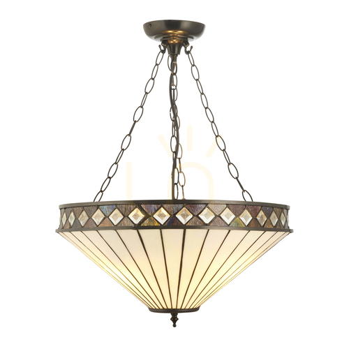
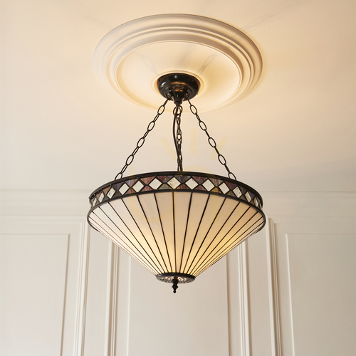
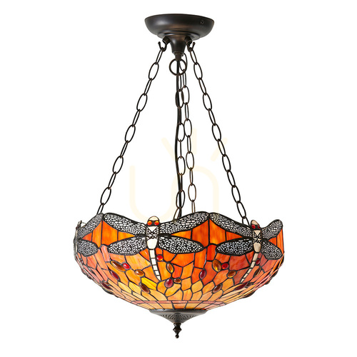
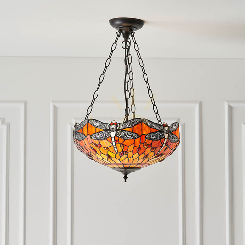
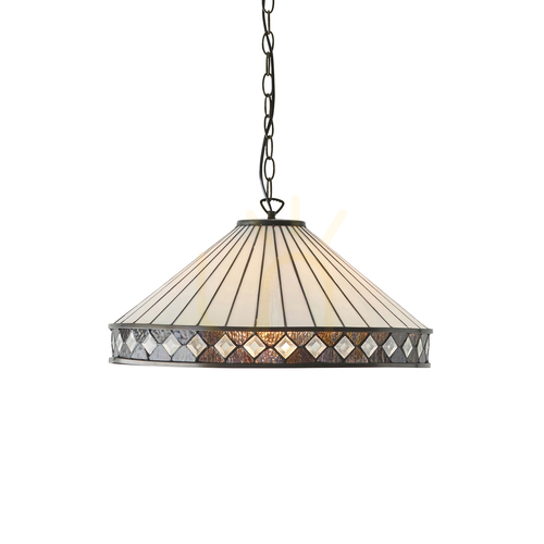
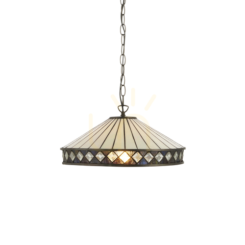
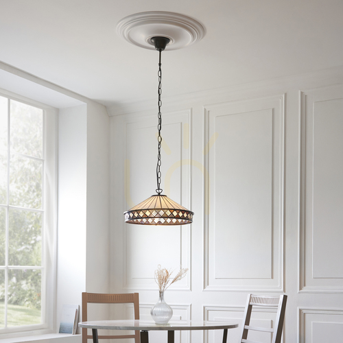
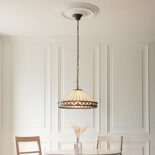
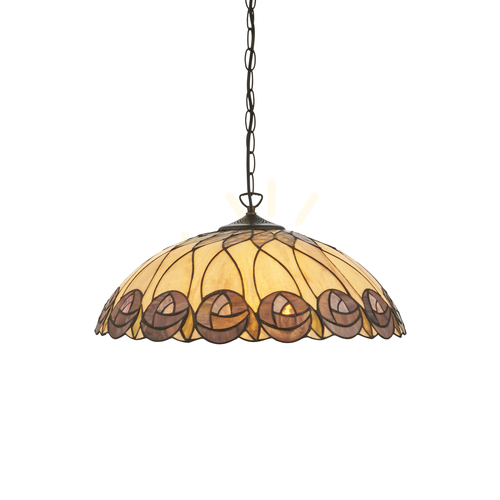
Colorful pendant lamps - liven up your interior with color
Introduction
Pendant lamps of color are changing the way we think about light in interiors. They are no longer just technical sources of lumens, but full-fledged decorative accents that build mood, organize space and strengthen the identity of the arrangement. A well-designed color pendant lamp can become the heart of a composition: over a table, in the axis of a living room, over a kitchen island or in a child's room. Importantly, the color of the luminaire and the character of the lampshade affect not only the visual perception of the room, but also our mood.. In this comprehensive guide, you'll find practical design tips, style inspiration and technical guidelines to make a colorful pendant lamp a thoughtful, durable and striking choice for years to come.
Why bet on color? The psychology of color in lighting
Color works faster than words. It brings energy to the house, emphasizes the character of the householders and allows to accentuate functional zones. Warm shades - reds, oranges and yellows - promote sociability, open up the space and conquer the feeling of coziness. Cool colors - blues, turquoises and greens - calm, organize and facilitate concentration. Subtle pastels soften contrasts, while deep, saturated tones (bottle green, cobalt, purple) give the arrangement stature and elegance. When a color pendant lamp appears in the center of a composition, its shade becomes a mood filter: even extinguished, it attracts the eye, and after dark it models the light and sculpts the space.
Color pendant lamp and interior style
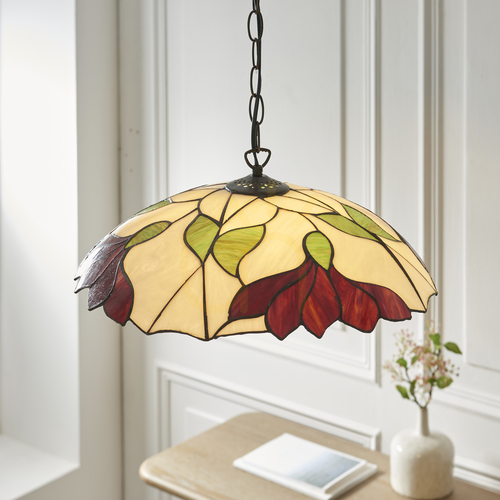
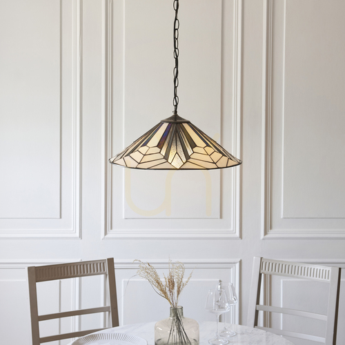
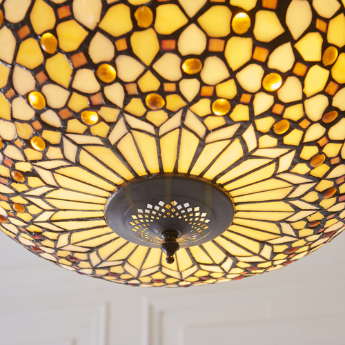
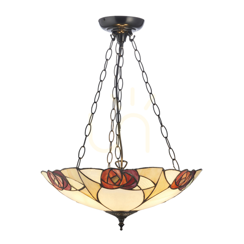
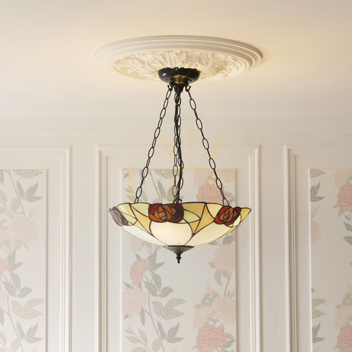
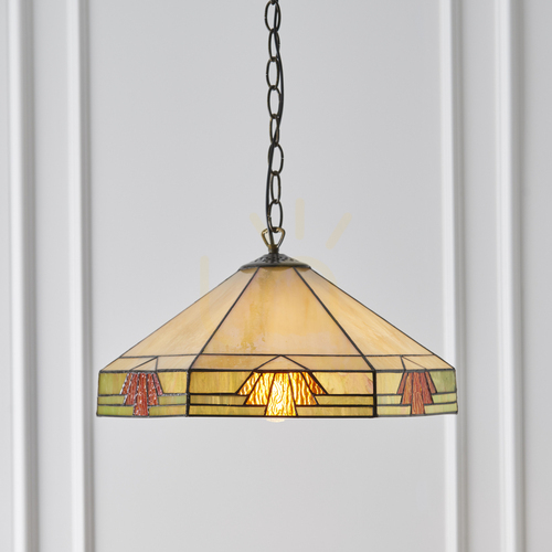
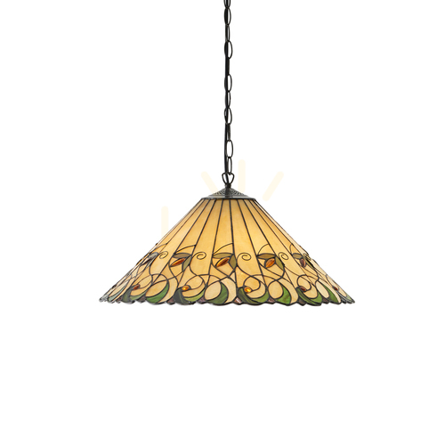
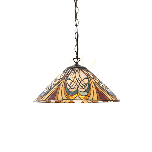
Color and form should resonate with the stylistic language of the apartment. In modern interiors, clean solids and bold color accents work well - for example, a single, intense green lampshade accompanied by bright walls and stone. Scandinavian style will go better with pastels, milky glass and light wood elements that emphasize softness and naturalness. Boho arrangements like multicolors, plaids, fabrics and stained glass, while industrial spaces like to embrace lacquered metals in intense colors, navy blues and dark greens juxtaposed with black and raw brick. If you are composing an eclectic interior, a colorful pendant lamp can be the glue that connects the different threads: it is enough to repeat its shade in two-three details (pillows, a graphic, a vase), so that the whole takes order.
Choosing a color for the function of the room
In the dining room, warm and energetic colors work well, conquering the appetite and promoting conversation. In the living area, a pendant lamp colored in shades of honey, terracotta or curry will go well - in the evening it will build a soft glow over the table. In the kitchen, you can afford vibrant accents over the island, but choose finishes that are easy to clean. The bedroom will like blues, graphites and bleached pinks - tones that calm the pulse of the arrangement. In a child's room, color is a zoning tool: different lamps over the desk, others over the play area and others by the bed. In a home office, a cooler spectrum (turquoise, sea green) will help keep your attention, especially when you juxtapose it with a neutral light color.
Materials and textures - how they affect light
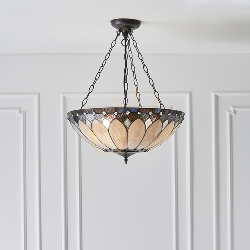
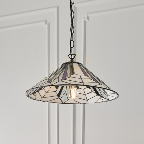
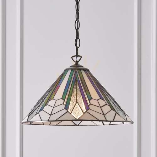
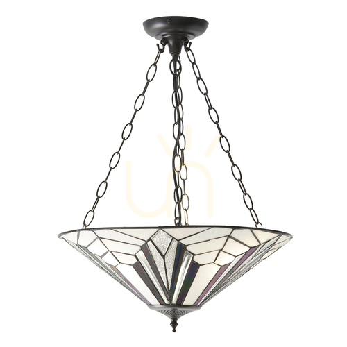
How we perceive color in the evening depends on the material of the lampshade. Tinted glass creates a subtle, even halo and beautifully diffuses the flow. The lacquered metal directs light, so it's great over a table or island when you want to illuminate the tabletop without overexposing the entire room. Fabrics and velours matte reflections and warm the atmosphere, while polycarbonates and acrylics allow for bold shapes and gradients. Ceramics give the impression of craftsmanship and pleasant massiveness, while rattan and wicker filter the light with a pattern that adds a soft rhythmic feel to the interior. When choosing a fabric, think not only about aesthetics, but also about service: smooth surfaces are easier to keep clean, and fabrics work better in areas less prone to dirt.
Where to hang a colorful lamp - a guide to zones
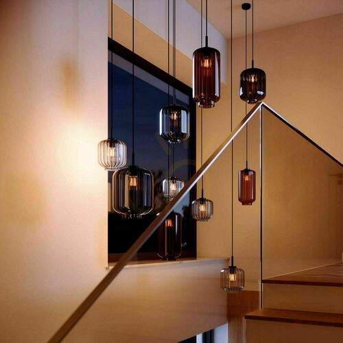
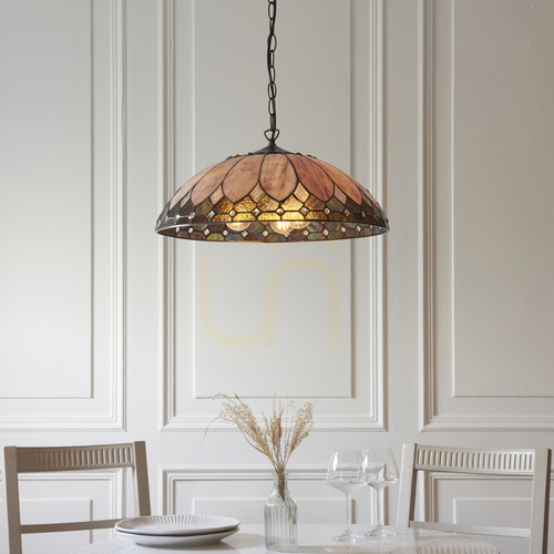
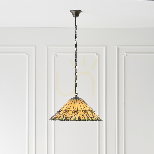
The living room benefits when the lamp sets the axis of the composition over the coffee table or in the center of conversation. In an open plan, it is good to tie the color of the lampshade to the color of the textiles to create a clear rhythm. In the dining room, the color pendant lamp emphasizes the stature of the table - optimally suspended so that the lower edge is about 75-85 cm above the tabletop, it provides eye contact and comfort. In the kitchen, a set of three smaller lampshades over the island gives even illumination and stands up well to daily use. In the bedroom, two colorful lamps above the bedside tables free up the tops and allow you to build independent scenes of light on each side of the bed. In the hallway and on the staircase, cascades and multi-level compositions are perfect to lead the eye and add dynamics to the space.
How to choose the size and proportions of the lampshade
Scale matters. Too small a lampshade will die, too large will overwhelm. A good practice for a rectangular table is to choose a fixture that is about one-half to two-thirds the length of the tabletop, or to use a sequence of several smaller lamps at equal intervals. Over a round table, spherical forms or soft ellipsoids with a diameter of one-third to about half the diameter of the tabletop work well. In high interiors, use long wires to bring the light closer to the living scene; in low interiors, choose shallower forms and shorter slings. Also keep in mind the optical weight of color: dark hues visually shorten a solid, light ones enlarge it, and shine enhances the presence of the lamp in the frame.
Light color and power - how they interact with the color of the lampshade
Colors look different under warm light and under neutral light. Warm 2700-3000 K will boost broken yellows, apricots and reds, while neutral 3000-3500 K will draw out the purity of blues, mints and cool grays. It is worth paying attention to the color rendering index - the higher it is, the more reliably we can see the shades of fabrics, wood and food. If the lampshade is transparent and the bulb is visible, bet on sources with a wide diffuser or decorative LED filament with a pleasant color temperature. A dimmer will allow you to switch the scene from work mode to evening relaxation without changing the lamp - especially valuable in living rooms and bedrooms.
Multi-point compositions, cascades and galleries of light
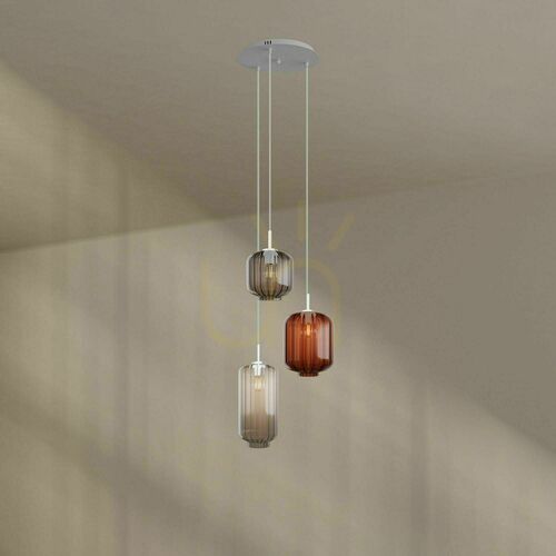
Colorful pendant lamps play beautifully as an ensemble. Three points over an island, five over a long table, or perhaps a cascade of seven lampshades in a hallway with a high ceiling? Vary the diameters and heights of the pendants, but repeat a common denominator - a shade of glass, a texture of metal or a detail of finish - so the composition remains consistent. Galleries of light also work well in commercial spaces: in the lobby, bar or reception area, they create an installation that is memorable and strengthens the visual identification of the place. In an apartment, such an arrangement allows you to zone the open space and give it scenographic depth.
Guide to colors - shades and effects in the interior
Red brings theatricality and warmth - it works great in dining rooms, but needs to be balanced in the bedroom. Oranges and corals enliven kitchens and living rooms; combine well with warm wood and rattan. Yellows and curries brighten even northern rooms, creating the impression of a longer day. Greenery - from olive to bottle - is calming, blends with plants and stone, and conquers a sense of balance in the office. Blues and cobalt bring freshness, discipline and a modern twist; in the bedroom, they build a mood of relaxation. Roses - powdery and peachy - soften minimalism, while purples add depth to the interior. Multicolored compositions work well in the boho spirit, eclecticism and in family interiors, where color is the story of the inhabitants.
Materials in practice - glass, metal, fabric, ceramic, rattan
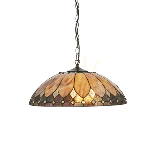
Tinted or smoked glass is timeless and easy to care for; it stands up well to changes in trends. Lacquered metal gives a precise stream, and in matte it looks modern and elegant. Fabrics and velours feel best in living areas and bedrooms; they create a warm glow and bring a feeling of softness. Ceramics offers unique glazes and subtle color heterogeneity that is difficult to fake with other techniques. Rattan and wicker in color are the best way to get a cozy, organic vibe - plus they draw shadows and textures on the walls. Whatever you choose, keep in mind the quality of the finish: smooth edges, stable slinging and a decent headliner testify to the class of the product.
Color vs. trends - what's in vogue
In recent seasons, the role of saturated but broken colors is growing: dark greens, cobalts, plums and brick oranges. You can also see the return of glass lamps in ombre versions and transparent spheres with a colored stem or wire accent.. The japandi spirit features beiges, celadons and warm grays juxtaposed with natural wood, while modern glamour is dominated by combinations of colored glass and brass. In the eco design trend, dyed ceramics, recycled glass and plaids in natural dyes are leading the way. The colorful pendant lamp becomes a conscious choice: it is to decorate, but also to harmonize with the rhythm of the house in the long term.
Ergonomics and suspension heights
Comfort starts with the right height. Above the table, a suspension 75-85 cm above the tabletop usually works well. In the communication space it is worth keeping min. 200 cm from the floor to the bottom edge of the lampshade to maintain freedom of movement. Above the kitchen island, adjust the height according to the activity - lower for precision tasks, higher when the island acts as a buffet. On staircases, guide the cascade so that no element crosses the line of sight and causes glare. If the lamp has a transparent shade, choose a source with low glare and a pleasant color temperature - this will make the color look natural throughout the day.
LED light sources - economy, durability, ambience
LED is the standard - it consumes less energy, needs to be replaced less often and allows you to control light scenes. In colored pendant lamps, the high CRI source maintains the fidelity of fabric and wall tones. Consider dimming and smart controls to switch your home from work mode to relaxation mode with one touch. If you go for decorative character, choose milky "globes" or warm-colored filaments; in directional fixtures, sources with a wide diffuser will work well. Remember that even the most beautiful colored pendant lamp needs the right "light engine" to shine to its full potential.
Maintenance and care in the daily rhythm
Regular, gentle cleaning prolongs the life of the lamp. Wipe glass with a soft, dry cloth, metal - especially in gloss - care with preparations for metal without abrasive additives. Vacuum fabrics with a soft tip, and brush velours according to the bristles. In the kitchen, pay attention to deposits - warm water with a little mild detergent is usually enough. Always unplug the lamp before cleaning and let the parts dry well. A little care pays off: the color remains saturated, and the lampshade maintains a perfect shine or matte.
The most common mistakes and how to avoid them
A too-small shade over a large table, the wrong hanging height or a haphazard color palette are the most common stumbling blocks. Avoid combining multiple intense colors without a common denominator - it is better to base the composition on two shades and one neutral base. Keep in mind the proportions of furniture and lamps: a large "colorful" one over a microscopic table will look heavy, and a tiny one will disappear over a large tabletop. If the space already has a strong color accent, choose a color pendant lamp in a shade that repeats this accent - instead of competing with it, it harmonizes the composition.
FAQ - answers to the most common questions
Won't an intense color overwhelm a small room? No, if you take care of the right scale and high quality of light diffusion. Does colored glass distort the shade of food on the table? With a warm source and high CRI, the colors are reliable; if in doubt, choose a soft-tinted or milk glass shade. How often to clean the lamp? Just lightly vacuum once a week and wipe down every few weeks; in the kitchen more often. Is it possible to combine several colors in one space? Yes, if you repeat them in other details and take care of the balance of saturation. Does a colorful pendant lamp go with the classics? As much as possible - pastel glass and elegant metals go well with classic compositions.
Summary - color as the language of your home
Colorful pendant lamps are both a tool and a decoration. Help zone the open floor plan, enhance the function of the furniture, build scenes of daily life. A well-chosen color pendant lamp - in scale, color and material - will become your design signature for years to come. Start with your needs, choose a shade that tells the story of the homeowners, and bet on the quality of the finish. When you turn on the light in the evening, you'll see the difference: the space will take on a rhythm, and the color will set a tone you'll return to every day.
A practical guide to selection
Define the role: a central light over a table, an accent over a coffee table, a cascade on a staircase or a working point over a countertop. Choose a material that is compatible with your use: in the kitchen - easy-to-clean glass or metal, in the bedroom - soft fabrics, in the hall - glass or ceramic. Match shade color to function: warm for hospitality, cooler for concentration. Check electrical parameters: socket type, maximum wattage, dimming compatibility. Plan the suspension height and layout of several luminaires to avoid glare and shadows in work areas. Finally, add a "dot over the i": a color repeated in two details will make the arrangement complete. A colorful pendant lamp is a decision that really works every day - for the function, mood and character of your home.
Color guide - in-depth design tips
Red and carmine: use spot-on over a table or bar; combine with wood tones and graphite to maintain balance. Choose glass or metal in gloss if you want to enhance the theatricality, or matte if you want a more gastronomic, bistro-esque look.
Oranges and terracotta: great in kitchens and dining rooms. Set with creams and linens to build softness. In the metal version they give a modern, industrial claw, and as a fabric - an atmosphere of domestic warmth.
Yellows and curry: "sunshine in a lamp". In northern, cooler rooms, it acts as a visual radiator. It works well in milk glass, which smooths the stream and prevents glare.
Greens: from sage to bottle. In living rooms and offices, they balance the proportions with nature - they harmonize beautifully with plants and stone. In transparent glasses they look noble, in frosted metals - modern.
Blues, cobalt, navy blue: they discipline the composition and add precision to it. In bedrooms they soothe, in work zones they improve focus. Gold or brass details will warm up the whole.
Roses and peaches: soften the minimalism, highlight the fabrics and make the "light feel nice". Velour lampshades in this palette create living room jewelry.
Purples and purples: a touch of luxury in the library or living room. Best in glass or ceramics with deep glazes that work under evening light.
Multi-colored mosaics: choose where the arrangement should tell a story - in children's rooms, family kitchens or recreational areas. Watch the rhythm and repetition of color in accessories.
Case study - metamorphosis of a dining room
Neutral dining room in white and wood gained character thanks to three lampshades in cobalt shade suspended 80 cm above the tabletop. The color was repeated in textile details and wall graphics, while the neutral base kept the calm. In the evening, the scene switches to mood mode thanks to LED dimming, and the colorful pendant lamp becomes a foreground actor. This is an example of how a single color decision can balance function and aesthetics without a costly overhaul.