
What is CRI? Colour rendering index explained
What is CRI? It is the colour rendering index (Ra): a number on a scale up to 100 that tells you how faithfully colours look under a lamp. In the EU, light sources for the home must have at least Ra 80, but in the kitchen, at the mirror, in the wardrobe and above a painting, choose Ra 90. The Ra figure alone does not show how a lamp renders red, so check R9 as well when you buy. The code 930 on the box gives away the CRI without digging through the specification, and in a hallway or garage paying extra for a higher CRI does not pay off.

Contents
- What is CRI (colour rendering index)?
- How is CRI measured?
- R9 and the other samples – what Ra does not show
- CRI and colour temperature – two independent parameters
- Typical CRI of light sources
- TM-30, or Rf and Rg – a newer way to rate colour
- What the rules say: a minimum of Ra 80
- How do you read CRI on the packaging and the product page?
- CRI lighting at home: kitchen, bathroom, wardrobe
- Lighting paintings: CRI, angle and protecting the artwork
- CRI 90 or 80 – which should you choose?
- Price and efficacy: what a high CRI costs
- Common mistakes when choosing CRI
- Frequently asked questions
- Summary
What is CRI (colour rendering index)?
CRI, the colour rendering index, describes how far the colours of objects under a given lamp drift from their colours under a reference light. Ra 100 means no difference for the colour samples used in the calculation, and the lower the score, the larger the colour shift.
Strictly speaking, CRI is the whole method and Ra is its general index – the single number printed on packaging. In everyday use the two terms are interchangeable. In practice:
- below Ra 80 – colours look noticeably less natural, often flat,
- Ra 80–89 – the market standard, fine for most rooms,
- Ra 90–94 – vivid, natural colours; the difference shows on skin, food and wood,
- Ra 95 and above – the level for studios, galleries and places where colour is judged professionally.
CRI says nothing about brightness or whether the light is warm or cool. On the product pages of our LED bulbs it sits next to lumens and kelvins, but it is the figure most easily overlooked when shopping.
How is CRI measured?
A laboratory measures the spectrum of the light source and calculates how a set of standardised colour samples would look under it. It then compares the result with the same samples under a reference light. Ra is the arithmetic mean of the scores of the first eight samples, R1–R8.
The method is set out in publication CIE 13.3 of the International Commission on Illumination (CIE). Each sample’s score, Ri, is 100 minus the colour shift multiplied by a fixed factor.
These eight samples are moderately saturated, fairly muted colours: a greyish pink, a dull yellow, several greens, a light blue, lavender and a heather violet. There is no saturated red and no skin tone among them – and that is where most of the index’s limitations come from.
The reference light is not always the sun. For sources with a colour temperature below 5000 K the reference is a black-body radiator at the same colour temperature – in practice a spectrum very similar to a classic incandescent bulb. From 5000 K upwards the reference is a modelled daylight. So Ra 95 at 2700 K means – for the samples being scored – “almost like a tungsten bulb”, while Ra 95 at 5000 K means “almost like daylight”. It does not mean the two spectra are identical.
Ra can even be negative. That is the case with low-pressure sodium lamps, which emit almost a single yellow wavelength: under them a red car and a green hedge look equally grey.
R9 and the other samples – what Ra does not show
On top of the eight basic samples, the CIE method defines six extra ones, R9–R14, and the Japanese JIS standard added a seventh, R15:
- R9 – saturated red,
- R10 – saturated yellow,
- R11 – saturated green,
- R12 – saturated blue,
- R13 – light skin tone (European complexion),
- R14 – leaf green,
- R15 – Asian skin tone.
None of them counts towards the Ra average. R9 matters most, because red hides in the colours we look at most often. It is in flushed cheeks and lips, in meat, tomatoes and strawberries, in warm wood tones, in brick and in the reds of paintings. With a low R9 a face looks tired, beef looks stale, and walnut and mahogany lose their depth.
Why does this happen? A white LED is in practice a blue diode under a layer of phosphor that converts part of the blue light into longer wavelengths. In simpler designs a yellow phosphor dominates, and that spectrum lacks deep red. A manufacturer who wants a high Ra and R9 adds a red phosphor. The eye is not very sensitive to deep red, though, so every bit of energy turned into red yields fewer lumens. That is why cheap Ra 80 LEDs often have an R9 around zero, sometimes even negative, even though their Ra looks respectable. Many Ra 90+ sources have an R9 above 50, and the best ones above 90, but Ra 90 on its own does not guarantee it.
When buying an Ra 90+ source, treat R9 above 50 as a separate criterion and check it in the data. A manufacturer who lists both figures usually has something to show off.
CRI and colour temperature – two independent parameters
Colour temperature (in kelvins) tells you what shade the white is: warm 2700 K, neutral 4000 K or cool 6500 K. The colour rendering index tells you how faithfully colours look in that white. They are two separate axes – one does not follow from the other:
- a halogen bulb at around 2800 K has an Ra close to 100, even though it is clearly warm,
- an older 6500 K fluorescent tube may have an Ra of around 70, even though it “looks like daylight”,
- 3000 K and 4000 K LEDs from the same range usually have similar CRI.
The most common mistake goes: “I want natural colours, so I’ll buy cool light.” A cooler colour does not improve colour rendering – it only changes the overall tint of the room. First choose the colour temperature for the mood and purpose of the room, then the CRI for how much colour matters in it.
Typical CRI of light sources
| Light source | Typical Ra |
|---|---|
| Incandescent and halogen bulb | approx. 100 |
| High-CRI LED | 90–98 |
| Typical LED bulb and LED strip | 80–89 |
| Compact and triphosphor fluorescent | 80–89 |
| Older linear fluorescent (halophosphate) | approx. 50–75 |
| High-pressure sodium (orange street lights) | approx. 20–25 |
| Low-pressure sodium | below 0 |
Halogen sets the bar by definition: below 5000 K its spectrum almost matches the reference. That is why many people feel that “something is off with the colours” after swapping halogens for ordinary Ra 80 LEDs in the kitchen, in a picture light or at the mirror. The eye remembers the previous light. If you are replacing halogens, aim for Ra 90+ with a high R9 – the difference will be much smaller.
TM-30, or Rf and Rg – a newer way to rate colour
CRI was created in the 1960s and has several well-known weaknesses. It uses only eight muted samples and an outdated colour space, and its average can hide one very poorly rendered colour. A manufacturer can also “tune” a spectrum to the eight test samples and achieve a nice Ra without genuinely good colour rendering.
That is why the American Illuminating Engineering Society (IES) developed the complementary TM-30 method (first version in 2015). The CIE adopted its fidelity calculation as the Rf index (publication CIE 224:2017). Instead of 8 samples there are 99 colours taken from real materials, and instead of one number there are two:
- Rf (fidelity) – on a 0–100 scale, it tells you how closely colours match the reference. It is the counterpart of Ra, just calculated more accurately.
- Rg (gamut) – tells you whether colours are on average more saturated (above 100), similarly saturated (around 100) or more washed out (below 100) than under the reference. It is an average – an Rg of 100 can hide boosted reds alongside muted greens.
A TM-30 report also includes a circular colour vector graphic: arrows show which hues are shifted and in which direction. Meat counters in shops are sometimes lit with sources that boost red. They have high saturation in the reds and lower fidelity – the meat looks appetising, but not the way it really looks. At home you usually want a high Rf and an Rg around 100; in preference studies, slightly boosted saturation tends to be rated as pleasant.
On packaging for household bulbs TM-30 is still rare; you are more likely to find it in the datasheets of professional fittings and gallery spotlights. If the manufacturer gives it, use this as a practical guide: Rf 90+ means very faithful colours, and an Rg of roughly 95–110 means saturation close to the reference. The vector graphic will show whether any single hue strays far from the rest.
What the rules say: a minimum of Ra 80
Since 1 September 2021, the requirements of Commission Regulation (EU) 2019/2020 on the ecodesign of light sources have applied in the European Union. Light sources covered by the regulation must have a CRI of at least 80. Exceptions include sources intended for outdoor and industrial use, where lighting standards allow a lower CRI. In that case, it must be clearly stated on the packaging and in the documentation. A source with an Ra below 80 and a note about outdoor or industrial use is not meant for the living room.
The same regulation requires CRI on the packaging of light sources sold on their own – rounded to a whole number, or as a range if the spectrum can be adjusted. In addition, the energy labelling regulation (EU) 2019/2015 requires the product information sheet in the EU’s EPREL database to include CRI. For LED sources it must also give the R9 value and a spectral power distribution chart. The QR code on the energy label takes you to that sheet, so you can check R9 with your phone.
For workplaces, the reference point is the standard EN 12464-1. It sets requirements for specific tasks: for typical office and school work it gives Ra 80, and for tasks that involve judging colour – such as colour inspection – Ra 90. The standard covers workplaces, not homes, but it is a good guide for a home office or a studio too.
How do you read CRI on the packaging and the product page?
Look for a number next to the Ra or CRI symbol, or a three-digit code whose first digit is the colour rendering class: 8 means Ra 80–89 and 9 means Ra 90 and above. Slogans without a number, such as “High CRI” or “True Colour”, guarantee nothing.
The number appears in several forms:
- “Ra>80”, “CRI ≥80”, “Ra 80+” – a declared minimum. Strictly, “>80” and “≥80” are not the same, and neither says anything about the upper limit. If the manufacturer is not advertising a 90, the real value is usually somewhere in the 80–89 range.
- “CRI 90”, “Ra>90”, “CRI 90+” – high CRI, a sensible choice wherever colour matters.
- “CRI 95+”, “Ra 97” – the top shelf: studios, galleries, photography.
- Ra and R9 together, e.g. “Ra 95, R9 > 90” – the best case, because you can see the reds too.
The photometric code: 827, 930, 940
LED strips and modules, fluorescent tubes and, increasingly, bulbs carry a code such as 827, 830, 930 or 940. The first digit is the colour rendering class, and the next two are the colour temperature in hundreds of kelvins. So 827 is Ra 80+ at 2700 K, 830 is Ra 80+ at 3000 K, 930 is Ra 90+ at 3000 K and 940 is Ra 90+ at 4000 K. Digits after a slash (e.g. 930/349) describe colour consistency and lumen depreciation over time – they have nothing to do with CRI. Some catalogues also use older colour rendering grades: 1A (Ra 90–100), 1B (Ra 80–89), 2A (Ra 70–79) and lower.
Product pages in our shop
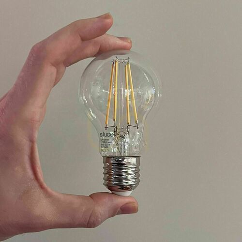
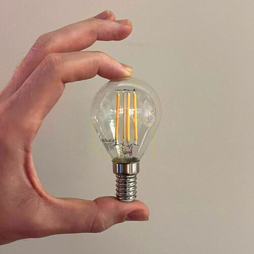
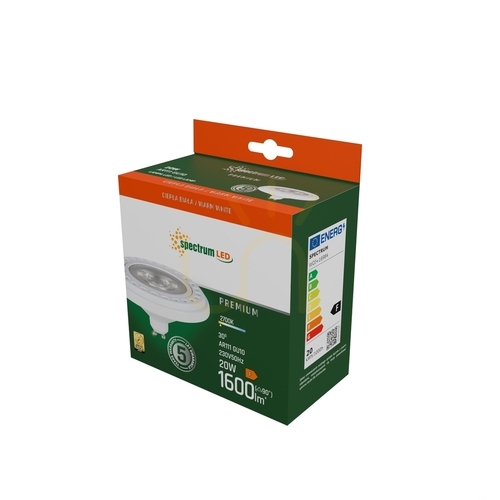
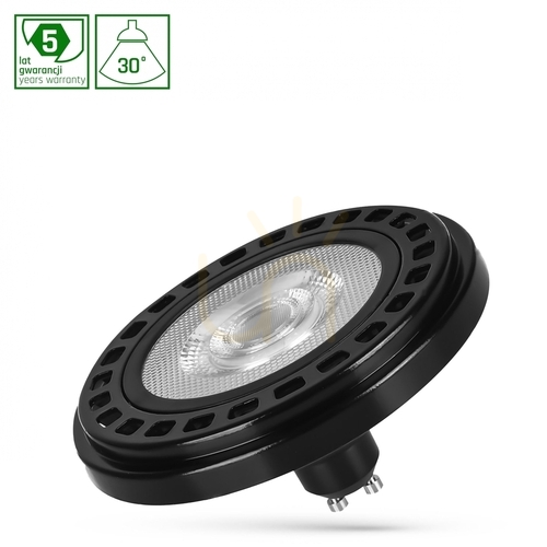
In the specification, look for the field “Color rendering index CRI” – it holds the value from the manufacturer’s data. If the field is missing, it does not mean the CRI is low, only that the manufacturer did not state it. For lamps sold without a light source (with an E27, E14, G9 or GU10 socket), the CRI depends mainly on the bulb you fit. A tinted shade also changes how colours look. For fittings with an integrated LED, CRI is a property of the fitting itself and you usually cannot change it with a bulb swap, so check it before you buy.





CRI lighting at home: kitchen, bathroom, wardrobe
Kitchen and food
This is where a low R9 gives itself away fastest: red meat looks brownish, tomatoes and peppers fade, and greens look wilted. Light only improves appearance – you cannot judge whether food is fresh or meat is cooked through by eye. Under the cabinets and above the island, LED strips or Ra 90+ fittings at 3000–4000 K work well, matching the ceiling lighting. A high CRI pays off above the dining table too: besides the food, it lights your guests’ faces.
Bathroom, mirror and make-up
At the mirror, R9 and R13 matter – red and skin tone. Under Ra 80, foundation can look like a good match and then turn out a shade too dark or too pink in daylight. For make-up and shaving, choose Ra 90+, ideally in a neutral 4000 K or with adjustable colour temperature. Light the face from the front and sides, not only from the ceiling. You will find ready-made solutions in our Illuminated Mirrors category. The right mirror depends on the bathroom zone and the required IP rating, and connecting it to the mains is a job for a qualified electrician.
Wardrobe and clothes
The classic case is navy and black, which look identical in poor light, and “matching” socks that turn out different outdoors. That last one is metamerism: two materials look the same under one light and different under another. It depends on the spectrum of the light and on the specific dyes, so a high CRI does not rule it out. Light closer to the reference does cut down on unpleasant surprises. Use Ra 90+ in the wardrobe and at the dressing mirror, and for important outfits check the clothes by a window anyway.
Desk, studio, hobbies
Painting, sewing, model making, photo retouching or choosing wall paint all involve judging colour. Here, in line with the logic of EN 12464-1, aim for Ra 90, ideally 95+, with a high R9, in a neutral 4000–5000 K.




Lighting paintings: CRI, angle and protecting the artwork
A painting is where the colour rendering index matters most: the artist usually mixed the paints in daylight, and you look at them in the evening under a lamp. A low R9 dulls cadmium reds and vermilion, a low R12 dulls ultramarine blues. So for art, choose at least Ra 90, ideally 95, with R9 above 50.
Colour temperature
Old oil paintings with warm varnish and gilded frames look best at 2700–3000 K. Contemporary art, prints, photography and works with lots of white and cool blues suit 3000–4000 K. Keep one colour temperature for all the paintings in a room.
Picture lights
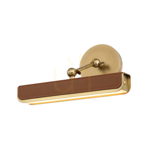
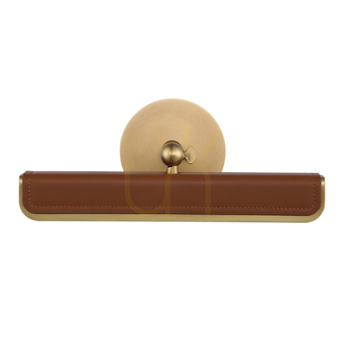
The classic solution is a lamp mounted above the frame, with an arm that directs light down over the canvas. As a starting point, choose a lamp roughly half the width of the frame; the arm must be long enough for the light to reach the bottom edge. For paintings taller than about 1 m, a light above the frame will light the bottom weakly and unevenly – a ceiling or track spotlight works better there. You will find a range of models in our Picture Lights and Wall Lights Above the Picture categories. Have a qualified electrician connect a hard-wired picture light, especially if the cable needs to come out above the frame.
Spotlights and the 30° rule
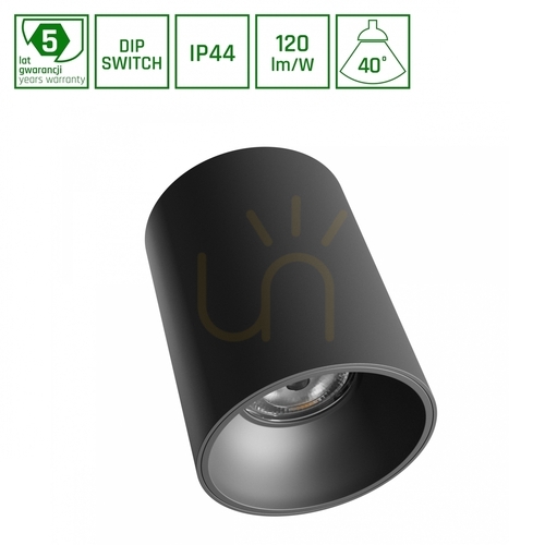
The starting point is to aim the spotlight at the centre of the painting at about 30° from vertical. Steeper, and the frame casts a long shadow over the top of the canvas; shallower, and reflections on the glass and varnish hit the viewer’s eyes. To work out the spotlight’s distance from the wall, multiply the height difference between the ceiling and the centre of the painting by 0.58. With a 2.6 m ceiling and the centre of the painting at 1.55 m, that gives about 0.6 m from the wall. For a single canvas, choose a narrow beam that does not spill across the whole wall. Fine-tune the angle from the spot where you usually look at the painting.
Protecting the artwork
Light gradually fades pigments, paper and textiles, and the damage depends on the dose – illuminance multiplied by time. Museums work to roughly 50 lx for watercolours, prints, drawings and textiles, and about 150–200 lx for oil and acrylic paintings, while also keeping track of total annual exposure. For valuable works, measure the illuminance with a lux meter and ask a conservator. In every home, three rules apply: do not hang valuable works in full sun (the biggest source of UV in a home), do not leave the picture light on all day, and choose LED over halogen. Typical white LEDs emit practically no UV and heat the canvas far less than halogen. For a painting behind glass, consider anti-reflective glass – it noticeably reduces reflections of the lamp and the window.


CRI 90 or 80 – which should you choose?
Choose Ra 90 where you look at faces, food, clothes or art: in the kitchen, above the dining table, at the mirror, in the wardrobe, in a home office and above a painting. Ra 80 is enough where you only pass through or where only the amount of light matters.
Ra 80 is not bad light – it is a sensible standard wherever colour does not play the leading role:
- hallway, landing, stairwell, porch – you pass through, you do not judge colours,
- garage, basement, storeroom, utility rooms – lumens matter, not hues,
- garden, façade and paths – outdoors, weather protection and light distribution matter more,
- decorative and mood lamps, e.g. 2200 K filament bulbs – they are there for atmosphere, not colour accuracy,
- indirect light bounced off the ceiling as a background, when the task lighting in the same room has a higher CRI.
Ra 90 also pays off in a living room with wood and fabrics, and anywhere you take photos or film. There is no need to replace working bulbs just for CRI; simply choose a better source in the important places next time you replace one.
Price and efficacy: what a high CRI costs
A higher CRI has a physical cost, not just a marketing one. The red phosphor that improves Ra and R9 turns part of the energy into deep red, to which the eye is not very sensitive. At the same colour temperature and with a similar design, an Ra 90 source therefore usually has an efficacy (lm/W) between a few and around 15 per cent lower than Ra 80. The exact difference depends on the manufacturer and the diodes.
Even EU Regulation 2019/2020 takes this into account. The formula for a source’s maximum permitted power includes a CRI factor of (CRI + 80) / 160: for Ra 80 it is 1.00, for Ra 90 it is 1.06 and for Ra 95 it is 1.09. A high-CRI source may therefore legally draw about 6–9% more power for the same luminous flux. The energy label has no such allowance, because the class is based on efficacy alone. So an Ra 95 bulb is sometimes one class lower than a similar Ra 80 model. That does not mean lower quality, just a different balance between lumens and colour fidelity.
If you swap an Ra 80 bulb for an Ra 90 one of the same wattage, you may get slightly less light, so compare lumens, not watts. The difference on your bill is small: for a household bulb it is a few per cent of a few watts. It counts in a large shop or office, but at home it rarely decides the choice. The premium depends on the product type – small for bulbs, more noticeable for LED strips and professional spotlights. Light with a high CRI and saturation is also often perceived as cleaner and brighter, despite slightly fewer lumens.
Common mistakes when choosing CRI
- Confusing CRI with colour temperature. Kelvins say nothing about colour accuracy.
- Looking only at Ra. In the kitchen, at the mirror and above a painting, check R9 as well.
- Mixing sources from different ranges in one room. Two 3000 K bulbs – one Ra 80, the other Ra 95 – can have a slightly different shade of white and render the colours of objects differently. Buy one range.
- Judging from photos online. Cameras and screens distort colour – go by the specifications.
- Too much light on a painting. More lux is not better – pigments fade faster and reflections increase.
Frequently asked questions
What do CRI 80, 90 and 95 mean on a bulb?
It is the colour rendering index on a scale up to 100. CRI 80 is the market standard, CRI 90 gives noticeably more natural skin, food and wood, and CRI 95 and above is the level for studios, galleries and photography. The first digit of a code such as 930 gives away the same class.
Does sunlight have a CRI of 100?
Sunlight’s CRI is not calculated, because daylight is the reference itself. Sources of 5000 K and above are compared with a CIE model of daylight, and real daylight is very close to it. For warm colour temperatures the reference is the spectrum of an incandescent bulb, which is why halogen has an Ra close to 100.
Can an LED have a CRI of 100?
The best LEDs claim Ra above 95, and a few designs get close to 98–99. In practice, an Ra close to 100 belongs to incandescent sources such as halogen. For colour-critical work at home, Ra 95+ with a high R9 is more than enough.
Does CRI 90 mean 90% of colours are rendered correctly?
No. It is not a percentage but a score calculated from the average colour shift of eight samples. Ra 90 means a smaller average shift than Ra 80, but it does not tell you which colours deviate the most – hence the importance of R9.
Does a higher CRI mean brighter light?
No. Brightness is described by lumens, and CRI by colour fidelity. An Ra 90 source of the same wattage usually gives slightly fewer lumens than an Ra 80 one, so when replacing a bulb, compare the luminous flux in lumens printed on the box.
Does dimming lower CRI?
With LEDs dimmed by current or by modulation, the spectrum usually changes little, so the CRI stays similar. “Dim to warm” lamps deliberately warm the colour as they dim, and a dimmed halogen becomes warmer but keeps a high Ra.
Can I measure CRI with my phone?
No. Measuring it requires a spectrometer, and a phone camera records only three colour channels. A simple home test cannot replace a measurement, but it will show a difference: compare a red apple, your hand and a coloured fabric under the lamp and by a window in daylight. If the reds and the skin tone clearly “fade” under the lamp, the source probably has a low R9.
What CRI does a lamp with adjustable colour temperature have?
In sources with adjustable colour temperature (CCT), the CRI can vary between settings, because each colour is produced by a different mix of diodes. Check whether the manufacturer gives the CRI for the whole range or only for one setting.
Does a CRI 90 LED strip make sense under kitchen cabinets?
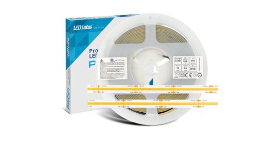
Yes, because it lights the worktop where you cut and serve. Look for a strip marked Ra 90 or with the code 930 or 940, and fit it in a profile with an opal diffuser. The diffuser blends the individual diodes and reduces glare on a glossy worktop.
Summary
Start with three places: the kitchen worktop, the bathroom mirror and the light above a painting. Buy Ra 90+ sources with a stated R9 there, and stay with Ra 80 in the hallway, garage and garden. Before you buy, check the CRI field in the specification or a code such as 930 or 940, and compare the lumens with your old bulb. You will find light sources with a stated CRI in our Light Bulbs category.
Przemysław Doliński


Maybe you will be interested in products from these categories?
Light Bulbs, Picture Lights
Tags & Blog Categories