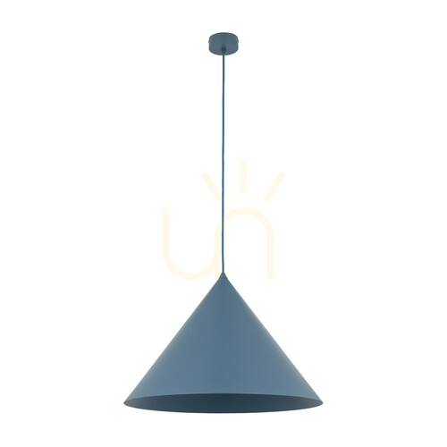
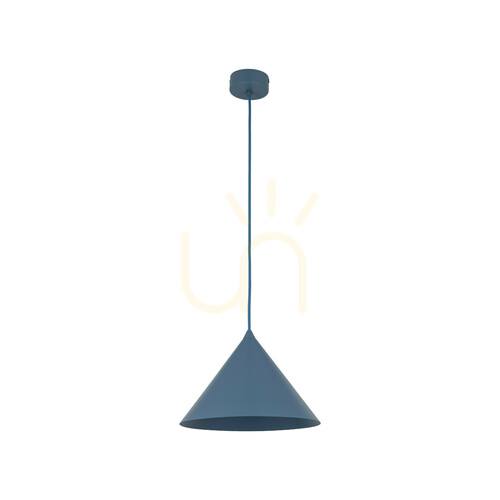
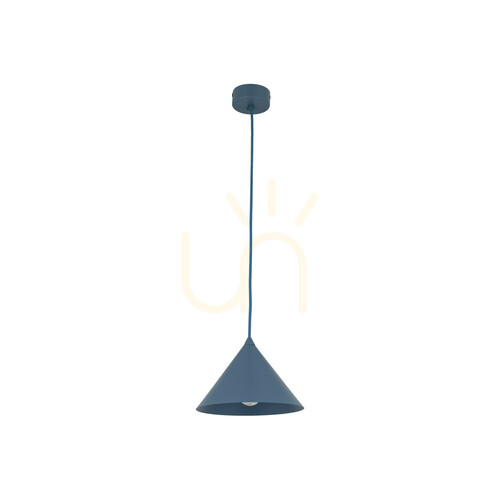
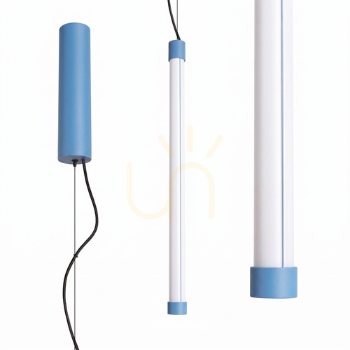
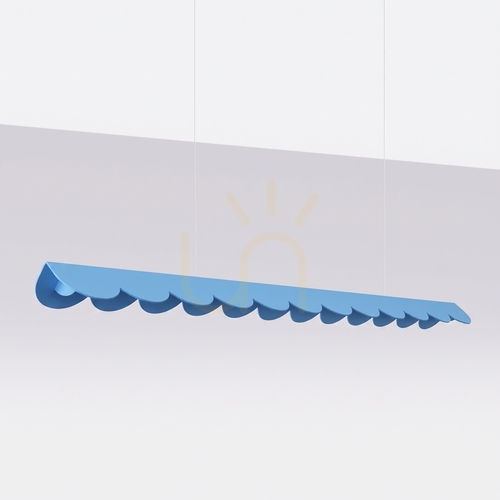
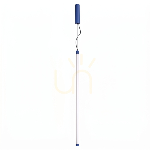
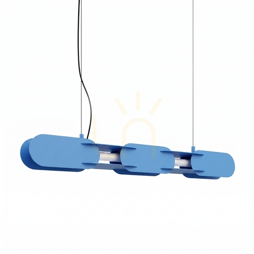
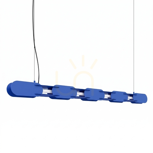
Blue pendant lamps - a comprehensive guide: style and function for modern interiors
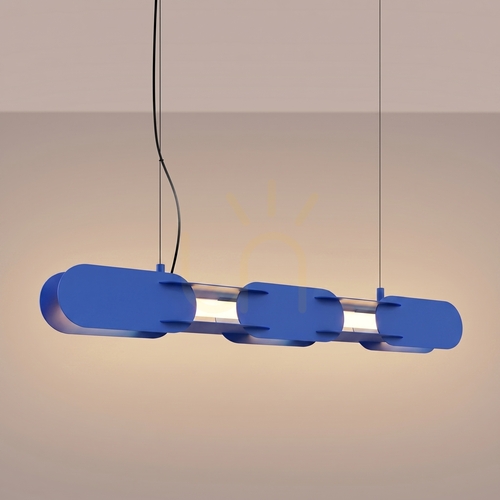
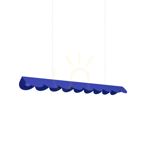
Blue pendant lamps have been inspiring designers and home users for years, as they combine the freshness of color and the functionality of lighting. Blue pendant lamp can give the interior a calm, clarity and lightness, and at the same time become a distinctive accent of the composition. In practice, this means that the blue pendant lamp will work well in the living room, dining room, kitchen, bedroom, study, as well as in children's and teenagers' rooms. In the guide we have gathered knowledge about form and scale selection, color psychology, light parameters, trends, and maintenance and installation.
How color works in interiors: from blue to navy blue
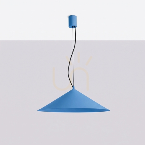
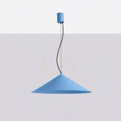
Blue is seen as the color of relaxation, space and freshness. In interiors, it plays an organizing role - it calms visual noise, helps focus attention on important elements and gives the room a feeling of neatness. Blue pendant lamps carry these qualities into the realm of light: their shades can soften the beam, accentuate cooler wall tones, neutralize excess contrast, or even create intriguing foci of color against neutral surfaces. Deep shades of navy blue and cobalt act as sophisticated interior jewelry, while a pastel blue pendant lamp brings a serene, light atmosphere. This makes the blue pendant lamp more than just a fixture: it is a stylistic narrative tool that combines color, texture and light.
Choice of form and scale: a composition that works every day
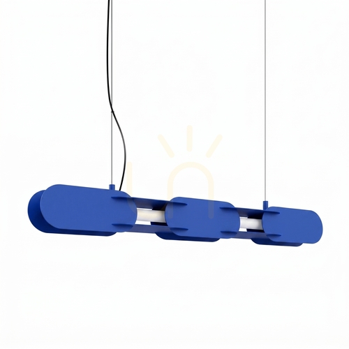
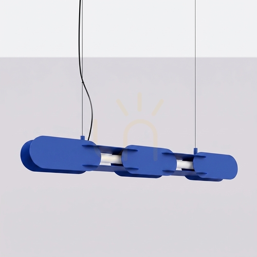
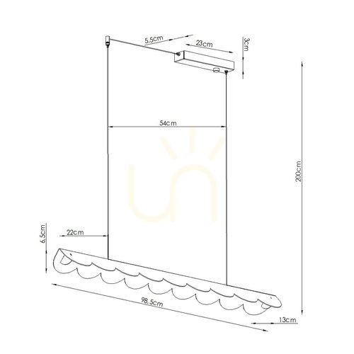
When choosing a blue pendant lamp, start with function. If the fixture is to illuminate the dining room table, what matters is even distribution and lack of glare; over the kitchen island, what matters is precision and the ability to adjust the height; in the living room, we usually look for a zoning effect that emphasizes the seating area. The principle of the scale is simple: the diameter of the lampshade above the table is usually within one-third of the width of the tabletop, and the lower edge of the lampshade is sometimes suspended about 70-85 cm above the table surface. High ceilings like cascade compositions - several lampshades at different points in height that sculpt the space and add dynamism to it. Compact interiors, on the other hand, will benefit from slender tubes or small hemispheres that are not visually overwhelming.
Materials and finishes: glass, metal, ceramic, fabric
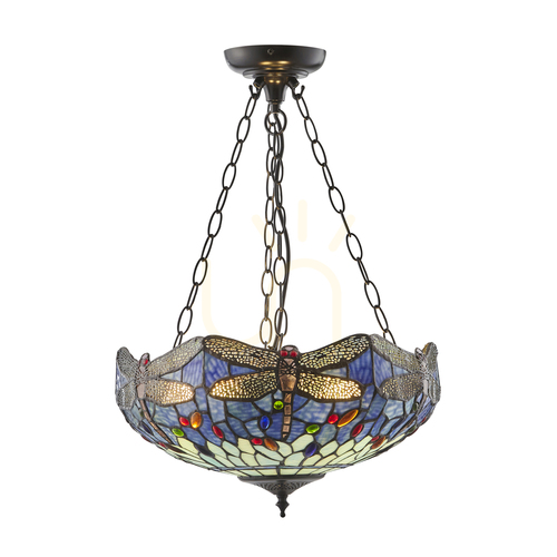
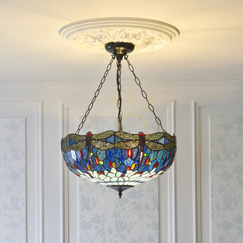
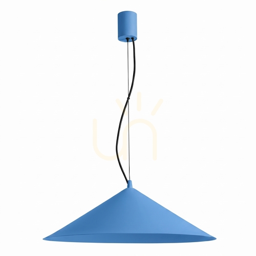
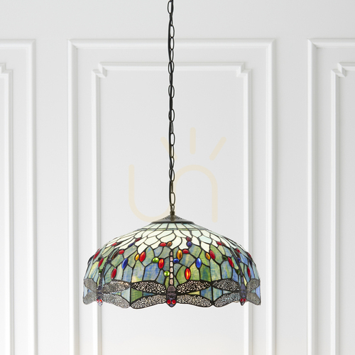
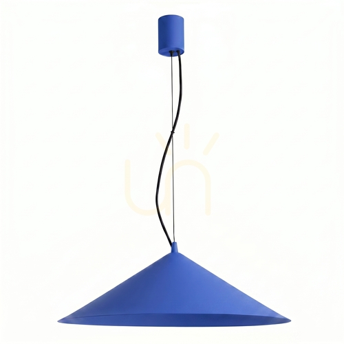
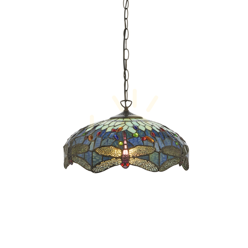
Blue glass pendant lamp provides beautiful diffusion and shimmering reflections, especially in a slightly transparent or smoky version. Milk glass tinted in cool blues softly diffuses light and creates a mood of tranquility. Metal shades in navy blue and cobalt give a more directional flow, which is sometimes an asset over a countertop or island. Ceramics allow for a rich plasticity of shape, and fabric lampshades in blue tones filter the light in a very homely way. In glamour or modern classic arrangements gloss and gold details will work, in lofts - matte and raw texture, in Scandinavia - blue plus light wood, in coastal climates - blue pendant lamp juxtaposed with white and natural linen.
Color and quality of light: temperature, CRI, dimming
The choice of source is crucial. For relaxation zones, a warm color of 2700-3000 K is recommended, which softens contours and harmonizes with blue lampshades. For a kitchen, study or workbench, a neutral 3000-3500 K works well to improve the readability of details. High color rendering index (CRI 90+) allows faithful reproduction of fabrics, wood and food - important both in homes and in the catering industry. Dimming systems and smart sources are becoming increasingly popular, allowing the blue pendant lamp to change the mood from utilitarian to atmospheric with a single touch.
Rooms and scenarios: living room, dining room, kitchen, bedroom, children's room
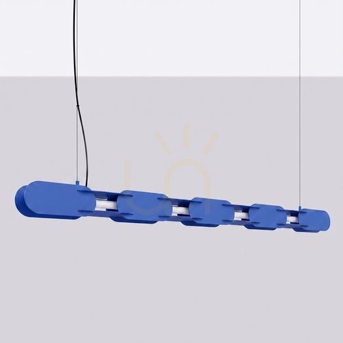
In the living room, blue pendant lamps organize the composition and build a focal point over the coffee table. In the dining room, a single large lamp or duo of lampshades emphasizes the ceremonial nature of meals. In the kitchen, a sequence of smaller fixtures above the island works best - optimally three, if the length of the countertop allows it. The bedroom will like the soft diffusion and lower glare - consider a pair of overhangs on either side of the bed, which frees up space on the bedside tables. In children's and teenagers' rooms, the blue pendant lamp organizes the space and promotes concentration, while easily combining with nautical, space and graphic motifs.
Multi-point compositions and art installations
When the square footage and ceiling height allow it, think of compositions composed of multiple lampshades. Groups of lamps hung at different lengths create a sense of movement and lightness. The mix of shades - cobalt, blue, turquoise - adds depth, while the uniform palette gives the effect of consistency. In lobbies and staircases, cascades of lamps lead the eye upward and make orientation easier. In restaurants and hotels, in turn, such installations become a brand showcase - guests remember the light as an experience, not just a function.
Ergonomics and visual comfort: suspension height and glare
The comfort of being under the lamp is determined by two simple rules: no direct view of the very bright source, and a suspension height adequate for the activity. Blue pendant lamp with transparent glass looks light, but requires sources with either a milky dome or an elaborate diffuser. Above the table, the lamp should not obscure the eye contact of the seated people. In passageways, it is a good idea to hang luminaires higher so that they do not interfere with the traffic of users. In offices and offices, we pay attention to reducing reflections on screens.
Installation and safety: practical tips
Before installation, always disconnect the electrical system, check the load-bearing capacity of the ceiling, and use the appropriate dowels and hooks. In the case of heavy luminaires - especially glass - it is worthwhile to provide additional reinforcements. Adjustable cable length allows you to set the height precisely, and a rosette masks the connection. In damp areas, use luminaires with the appropriate waterproof rating. Also keep in mind dimmer compatibility and the manufacturer's requirements for LED sources.
Maintenance and care: glass, metal, textiles
Clean glass with a soft, slightly dampened cloth and a mild cleaner. Avoid rough sponges that can scratch the surface. Clean metal lampshades dry or slightly damp, and dry lacquered parts right away to avoid streaks. Vacuum fabric lampshades with a soft brush, and if the manufacturer allows it - spot clean. Regular maintenance preserves color and shine, keeping blue pendant lamps looking like new for years.
Sustainable choice: energy efficiency and long life cycle
Choose fixtures that allow for light source replacement and service. Energy-efficient LEDs lower bills and reduce emissions. Durable materials - glass, metal, ceramic - slow down the aging of the product, and the universal blue palette makes the lamp stand up well to changing arrangements. This is not only a matter of aesthetics and cost of ownership, but also a real contribution to a smaller environmental footprint.
Trends and directions: minimalism, soft loft, coastal, modern classic
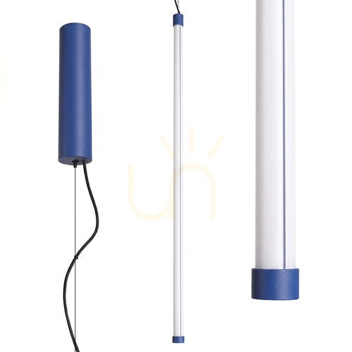
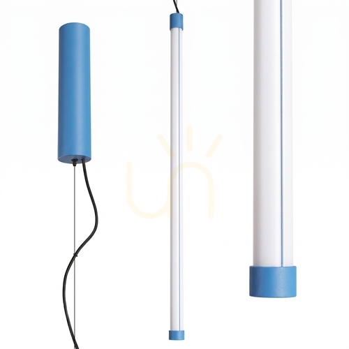
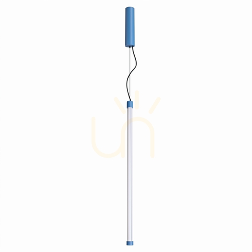
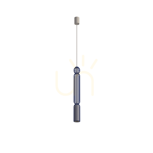
Two parallel trends are evident in the market: form reduction and decorativeness. Minimalist blue pendant lamp with geometric shape perfectly complements Scandinavian and Japanese. On the other hand, decorative shades of tinted glass, crystal details and noble brass joints are making a comeback. Coastal climates are keen on blue pendant lamps juxtaposed with white and plaids. Modern classic is dominated by spheres of milky glass in shades of blue and tubes on long wires that draw elegant verticals.
Arrangement inspirations: practical examples of combinations
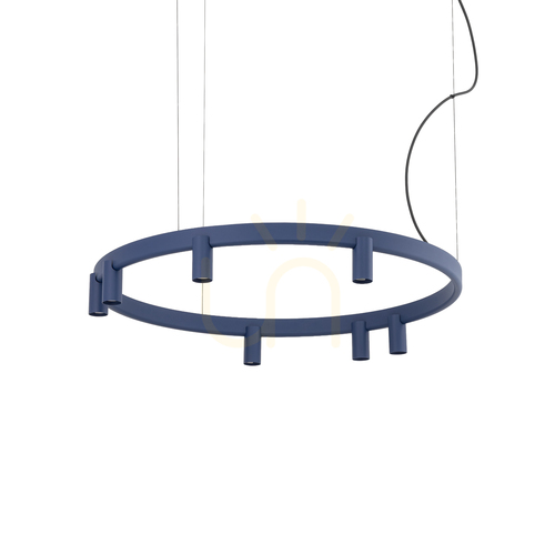
In a white kitchen, three tubes in cobalt over the island add depth and rhythm, while gold details warm up the whole thing. In the living room with a bright sofa, the navy blue ball above the coffee table becomes a dominant feature that clips the rug, curtains and wall graphics. In a bedroom with a palette of beiges, a pastel blue pendant lamp in duet with a table lamp of similar fabric builds a cohesive ritual of evening tranquility. In a teenager's room, matte turquoise lampshades and graphite accents bring order to the study area, while making it easy to change accessories without a costly overhaul.
The most common mistakes and how to avoid them
The first mistake is the wrong scale - too small a lampshade disappears, too large one dominates. The second - height: hanging too low over the countertop makes eye contact difficult, and too high worsens the uniformity of illumination.. Third - ignoring glare with transparent glass. Fourth - underestimation of light flux and lack of a layered lighting plan. The fifth - a haphazard palette of blue shades that brings chaos instead of harmony. Each of these mistakes is easily corrected by applying simple principles of scale, height and source selection.
Case study: from design to effect
The open-plan apartment relied on a set of three shades of blue to navy blue over the island and a single blue pendant lamp over the table. Dimming created two scenes: a working and a dining room scene. In the bedroom, two slender fixtures were hung on the sides of the bed, freeing up space on the countertops. The effect? Stylistic consistency, greater ergonomics and a noticeable drop in energy consumption after switching to LED.
Summary: why you should choose blue pendant lamps
Blue pendant lamps combine aesthetics and functionality. They fit many styles, stand up well to rearrangements and offer a wealth of forms and materials. Blue pendant lamp can calm, emphasize, organize and even surprise. Combined with a well-chosen light source, it creates scenes that enhance daily life on a daily basis. It's worth looking for models that are serviceable, support energy efficiency and allow for adjustment, because it's an investment that pays off for years.
Expert extension: detailed design and technical guidance
Lighting design begins with a functional plan. For work zones, plan 300-500 lux, for dining areas 150-300 lux, and for relaxation zones 75-150 lux in general light, with the possibility of local illumination. In practice, we often combine the blue glass pendant lamp with wall sconces and linear lighting to achieve balanced layering. It is worth taking into account the UGR coefficient, which describes the glare - although in a residential setting we rarely count it formally, we intuitively strive for comfort: milky diffusers, appropriate suspension height and avoiding bare filaments at eye level. Acoustics are sometimes underestimated - large fabric lampshades in blue tones can minimally improve the absorption of high frequencies, which, in combination with carpet and curtains, improves the comfort of conversation.. In traffic areas, linear compositions guide the user, and in long corridors, the repetition of lampshades draws a rhythm and visually shortens the perspective. If the interior is rich in textures and patterns, it is better to use matte lampshades, which will reduce reflections and maintain legibility. In sleek, minimalist spaces, shine adds life and creates points of light that bring raw geometry to life. Color balance is another rule of thumb: blue pendant lamps stand up well to the company of green plants, light beiges and warm grays; with black they create a stark, graphic contrast. In commercial arrangements where repetition and service are important, choose modular suspension systems and sources with interchangeable LED modules. From a maintenance perspective, this reduces downtime and facilitates parts management. Finally - control. A simple dimmer is a minimum, but we are increasingly using daily schedules and scenes that keep an eye on the routine: brighter during the day, warmer and quieter in the evening. All this makes the blue pendant lamp an active element of well-being, not just a decoration.
Color inspirations and material palettes
The palette of blue in interiors ranges from almost white blues to ink blue garnets. In practice, this means that saturation can be fine-tuned to suit the function of the room and the time of day. In display areas, navy blue harmonizes with walnut wood and brass to create a club atmosphere; in family kitchens, blue emphasizes hygiene and freshness. A blue pendant lamp can also provide a counter accent in a warm beige space - thus achieving a thermal balance of colors. Glass gradients are also a good option, where the upper part of the shade is darker and smoothly transitions to a lighter one, which reduces glare from above and illuminates the countertop. Combining with stone opens up further possibilities: blue and gray marblite, warm sandstone with turquoise, or distinctive granite with cobalt. In bathrooms, airtightness classes are key, but color does not lose its importance - the blue pendant lamp warms the white of the tiles and adds depth to the mirrored surfaces. In co-working spaces, blue pendant lights differentiate the zones: lighter blues in the café area, darker blues above the project tables, where focus is important. In retail stores, blue lampshades build brand identity related to technology, sea or freshness.
Technical guide: light output, proportions and heights
Matching light output to interior function is the foundation of design. In practice for a dining table 1200-2500 lumens works very well depending on the size of the tabletop, the color of the surface and the height of the suspension. Brighter, glossy tables require fewer lumens, dark and matte tables require more. If the blue pendant lamp has transparent glass, choose sources with a wide angle of light and with a milky diffuser to avoid spot reflections on the dishes. The proportions of the lampshade should be planned in relation to the nearest piece of furniture: over a narrow, long table top an oblong lampshade or a sequence of three smaller fixtures will be better, over a round table a sphere or hemisphere will work well. Adjust the height of the suspension after trying it in real use - the comfort of conversation and lack of glare are more important than a rigid measure.
Wall colors and materials vs. blue lamps
Wall color affects the perception of lampshade color and the temperature of the perceived light. White and cream backgrounds enhance the effect of freshness, grays and graphites give the composition a more urban and modern tone, and wood introduces natural warmth. Blue glass pendant lamp duo with oak veneer creates a balance of coolness and warmth, which works especially well in living rooms open to the kitchen. With walls in intense colors, it is better to opt for a simple form of lampshade in a uniform shade to avoid visual chaos. Metallic navy blue reflects beautifully in the sheen of marble, while blue mats soothe the harshness of architectural concrete.
Textures also make a difference. Velour curtains in a shade of Prussian blue can tie the color of the lamp to soft surfaces, and linen blinds at a pastel setting build a holiday atmosphere. In children's rooms, blue pendant lamps are worth pairing with wooden furniture and a short-pile rug, which makes it easier to keep things neat and not overloaded with stimuli.
FAQ in the form of paragraphs: answers to the most common questions.
How to choose the diameter of the lampshade for the table? It is assumed that the diameter of the lamp over a round table should be about 30-50% of the diameter of the tabletop. For rectangular tables, we use oblong shades or several luminaires set at equal intervals, but the width of a single shade should not exceed the width of the tabletop to avoid glaring reflections. A blue pendant lamp with too small a diameter will lose its decorative effect, with too large - it will dominate the table.
Is the cold light color allowed? It is, but in moderation. Cold light of 4000-5000 K promotes activity and readability of details, which is sometimes helpful in the kitchen or at work. In relaxation areas, however, a warm color is preferable. A blue pendant lamp in light that is too cold can appear sterile, while in warm light it can appear friendly.
Are several shades of blue in one room a good idea? Yes, provided you build up the saturation scale - one dominant shade (e.g.. navy blue), one medium (cobalt) and one light (blue). This order makes it easier to combine textures and does not overload the eyes.
Examples of design adjustments: small changes, big effects
In the dining room, where the lamp was hanging too high, lowering the lampshade by 12 cm improved the comfort of seeing food and reduced glare. Changing the source to an LED with a CRI of 95 and a warm color of 3000 K gave the blue lampshade depth and the wood of the table a more natural hue. In the living room, replacing the transparent filament bulb with a milky one reduced reflections in the TV screen. In the kitchen, the addition of a third fixture above the island equalized light levels along the entire length of the countertop, making cutting and cooking easier.
Light scenarios and automation in practice
Even the simplest controller allows the recording of three basic scenes: daytime for work, dinner for conversation, and evening for relaxation. The blue pendant lamp can be the same object in each of them, which changes character through dimming and color temperature. In smart systems, it's a good idea to link scenes to the sunset and calendar so that the lighting supports the householder's diurnal rhythm.